|


| |
|
Sub-problem 1b - Page 9 of 9 |
ID# C201B09 |
Sub-problem 1b: Maxwell Drive PM Peak Hour - With Conditions
Uncertainty Issues
Estimating site-generated traffic is a
challenge. It’s difficult to say with assurance how much traffic will be
generated. Thus, a sensitivity analysis has value. It pays to
look at variations in volume, both up and down from the projected numbers, to
see what trends exist in cycle length, level of service, queue length,
etc.
For this particular intersection, let’s look at three situations: the base
case (Dataset 10),
a condition with 30% more site-generated traffic (Dataset
13), and a condition with 30% less site generated traffic (Dataset
14).
The results are presented in Exhibit 2-18. It’s
interesting that increasing the site-generated volumes by 30% raises the
cycle length substantially from 65 to 77 seconds. The delays also increase
from an average of 28.7 seconds to 34.4 seconds. However, when the
site-generated traffic is lower by 30% there isn’t a significant change.
The cycle length stays at 65 seconds, the average delay drops only
marginally from 28.7 to 28.5 seconds.
|
Exhibit 2-18.
Maxwell Drive Effects of Generated Traffic |
|
Scenario |
Cycle Length |
Performance Measure |
EB |
WB |
NB |
SB |
OA |
|
LT |
TH |
RT |
Tot |
LT |
TH |
RT |
Tot |
LT |
TH |
RT |
Tot |
LT |
TH |
RT |
Tot |
|
Dataset 10 C-4 |
65.0 |
Delay |
38.8 |
19.5 |
22.6 |
15.4 |
34.4 |
32.5 |
17.3 |
39.5 |
24.3 |
25.1 |
38.0 |
31.0 |
28.1 |
34.2 |
28.7 |
|
Queue |
4.6 |
10.3 |
- |
2.2 |
17.6 |
- |
2.3 |
2.0 |
2.8 |
- |
8.0 |
1.2 |
3.9 |
- |
- |
|
Dataset 13 |
77.0 |
Delay |
39.3 |
24.7 |
27.0 |
28.4 |
43.3 |
41.4 |
19.8 |
39.4 |
27.5 |
27.3 |
44.7 |
33.9 |
27.6 |
38.2 |
34.4 |
|
Queue |
5.1 |
13.2 |
- |
3.9 |
21.3 |
- |
3.5 |
2.9 |
4.3 |
- |
9.5 |
1.8 |
4.3 |
- |
- |
|
Dataset 14 |
65.0 |
Delay |
38.8 |
18.6 |
22.0 |
11.0 |
34.4 |
32.7 |
16.6 |
31.0 |
23.0 |
22.4 |
38.0 |
29.7 |
28.1 |
34.2 |
28.5 |
|
Queue |
4.6 |
9.7 |
- |
1.4 |
17.6 |
- |
1.6 |
1.3 |
1.9 |
- |
8.0 |
0.8 |
3.9 |
- |
- |
|
 |
|
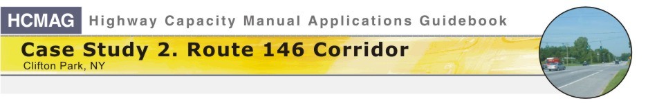
Exhibit 2-19.
Maxwell Drive Delay Patterns among Scenarios |
It’s hard to see the
trends in delays, etc. directly from the table. A graphic is useful.
Exhibit 2-19 shows a radar plot of the delay trends. Each axis of the wheel is used
to present the delay for a given movement. The lines and symbols show the
delay for a given scenario. All five operational solutions discussed in
Exhibit 2-17 and
Exhibit 2-18 are included. If you look at the plots for C-4
(the base case) and Datasets 11 and
12, that trend is clear. The pattern for
Dataset 11 is outside the pattern for C-4, which makes sense since the site
traffic volumes for Dataset 11 are 30% greater than for C-4. The pattern for
Dataset 12 is inside the pattern for C-4 for a similar reason. The
site-related traffic is 30% less than in C-4. The patterns for scenarios C-7
and C-8 are different. Most notably, in both of those scenarios there are
more lanes available for the northbound and southbound lefts. In C-7, we’ve
provided two left-turn lanes on both approaches. In C-8, there are three
lanes being shared among the lefts, throughs, and rights, both northbound
and southbound. As a result, the SL delays in particular, and the NL delays
to a lesser extent, are noticeably smaller than they otherwise might
be if the extra lane capacity had not been provided (i.e., the pattern in
C-4 would have still applied).
[ Back ] [ Continue
]
to Discussion |
|